A technique for better timing


Like the surface of an ocean or a large lake, the market will at times be virtually still, at other times show distinct wave movements, or move agitatedly and chaotically without any clear rhythm.
Viewing charts over multiple timeframes is a useful tool for optimal timing.
Like the surface of an ocean or a large lake, the market will at times be virtually still, at other times show distinct wave movements, or move agitatedly and chaotically without any clear rhythm. For a trader, a lot is about looking for patterns in price behavior and looking for situations where it can be attractive to take a position. One must assess what is the current main direction in the market, form an opinion on whether this can be assumed to continue, and then ideally find the optimal time to act. All this is done with the underlying insight that no one can know with certainty the next movement in prices. The normal assessments of liquidity, solvency and position size must always be taken, but techniques to improve timing can be of significant help to improve entry and choice of stop-loss level.
In this context, it is of great help to be able to observe the charts of the underlying instrument you are going to trade over several timeframes. What is the big picture? Where is it trading now in relation to the overall picture? Can one see any relevant trends, or support/resistance levels? How have the prices behaved when these are tested. How deep you go into this will depend on personal preferences. The sharpness of the timing gets better the further down you go, but it is also important not to lose sight of the bigger picture. Let me show an example of how to go down in layers.
Weekly charts for the long trends
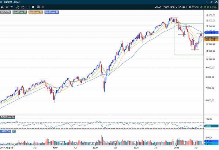
The chart above shows weekly candlesticks on NASDAQ 100 index futures for the past 5 years. As we can see, the rise over these 5 years has been formidable, but the rhythm of the price movements changed in the area marked with a green box. The NASDAQ here went from a classic uptrend with higher peaks and higher bottoms, to exhibiting a downtrend pattern with lower peaks and lower bottoms. Until the index breaks this pattern, the chart cannot be said to be very bullish in a weekly perspective. Also note the blue curve showing the 40-week (equivalent to 200-day) moving average. The price has fallen below this level, and for now has failed (turned down again) after a recent test of this from the downside. The weekly chart thus gives reason to be somewhat careful with the NASDAQ.
Daily charts – The medium trend

The price chart above now shows NASDAQ 100 index futures as daily candlesticks over the past year, and thus gives a closer insight into recent developments than the longer picture shown in the first chart. Whether this should be called short or medium term can be debated. There are many people who only use charts with daily closing rates as a decision basis for positions. I am also among those who look mostly at this perspective, but mostly I use an even shorter time timeframe in most of the position taking.
We see that this chart shows the same main trend of falling tops and falling bottoms as on the weekly chart. In the green box, however, a secondary trend of rising tops and rising bottoms is seen, until the last rising bottom was taken out of price falls in recent days. You can say that the chart is currently a picture of a "bear market rally" throughout the summer. In other words, we now have a medium-term positive trend within a longer-term negative trend. The index must establish itself above the last peak at approx. 13660 and 200 day moving average (blue curve) to break this impression.
Hourly charts and even shorter timeframes
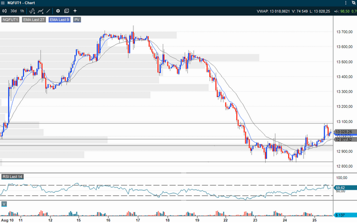
In this chart we have gone into an even shorter time perspective, and each bar (candle) now shows 1 hour of prices. As NASDAQ 100 index futures are traded 23 hours a day, there is a lot of data, and we have to zoom in a little more than on a normal stock chart. I have chosen to show some horizontal support and resistance levels from further back in the chart. These are typically drawn at levels where there have been previous tops, bottoms, consolidations or the like. We see here, interestingly enough, that the downward trend from the last few days has been broken. First through a sideways movement that led to a break in the moving averages that led the index downwards. Then on breaking up through the last previous highs in the short-term chart. Typically, we also see examples of prices coming down again to test these levels, and that they now act as support. This chart is mildly bullish and may indicate that the recent days' decline and sideways consolidation on the daily chart might now be followed by another upward move.
This process can continue even longer, by moving into increasingly shorter timeframes. Sooner or later, however, you will get so low that you risk picking up more noise than information. This also depends to a large extent on the liquidity of what you trade. If the underlying is index futures, or the very most liquid shares and raw materials, you can go quite low. For most people, however, a daily chart and a 1-hour chart with candlesticks, together with a line chart showing the price right now, will be sufficient.
The ideal risk/reward entry is perhaps where the long-term and medium-term trend coincide, and where there has also been a correction back to technical support in the shortest timefrimes. When prices then reverse in the direction of the higher timeframe trend, you will have a situation where all three time perspectives give the same signal, and where the level at which the course latest reversed gives a natural stop-loss level. This is a good setup.
Disclaimer: After many years in the brokerage industry, in 2021 I published "Paleo Trading: How to trade like a Hunter-Gatherer” and launched a hedge fund that trades according to the principles described in the book. Vontobel asked if I would write posts for their blog, similar to what traders and managers do in other countries. It is emphasized that nothing written on this blog is to be regarded as personal advice or a concrete call to take positions. Everyone must be responsible for their own decisions and familiarize themselves with the products they use.
Risks
External author:
This information is in the sole responsibility of the guest author and does not necessarily represent the opinion of Bank Vontobel Europe AG or any other company of the Vontobel Group. The further development of the index or a company as well as its share price depends on a large number of company-, group- and sector-specific as well as economic factors. When forming his investment decision, each investor must take into account the risk of price losses. Please note that investing in these products will not generate ongoing income.
The products are not capital protected, in the worst case a total loss of the invested capital is possible. In the event of insolvency of the issuer and the guarantor, the investor bears the risk of a total loss of his investment. In any case, investors should note that past performance and / or analysts' opinions are no adequate indicator of future performance. The performance of the underlyings depends on a variety of economic, entrepreneurial and political factors that should be taken into account in the formation of a market expectation.
Disclaimer:
This information is neither an investment advice nor an investment or investment strategy recommendation, but advertisement. The complete information on the trading products (securities) mentioned herein, in particular the structure and risks associated with an investment, are described in the base prospectus, together with any supplements, as well as the final terms. The base prospectus and final terms constitute the solely binding sales documents for the securities and are available under the product links. It is recommended that potential investors read these documents before making any investment decision. The documents and the key information document are published on the website of the issuer, Vontobel Financial Products GmbH, Bockenheimer Landstrasse 24, 60323 Frankfurt am Main, Germany, on prospectus.vontobel.com and are available from the issuer free of charge. The approval of the prospectus should not be understood as an endorsement of the securities. The securities are products that are not simple and may be difficult to understand. This information includes or relates to figures of past performance. Past performance is not a reliable indicator of future performance.